Personalizing digital autoimmune self-care
Case Study
Role
UX designer, UX Researcher
Team members
Vania Liu, Tyler Gates, Eric Ivanenko
Timeline
Jan. 2023 | 3-week sprint
Tools
Figma
Methods and Approach
User Research, Affinity Mapping, Persona Creation, Journey Mapping, Competitive Analysis, Wireframing, Prototyping, Hi-Fi Mockups, Usability Testing
View Prototype
Small habits, big change
Your Daily is an app created to support women with autoimmune disease on their self-care journey. Their believe that building small habits targeting user's specific nervous system regulation needs will need to sustainable health improvement.
In this 3-week sprint, our team collaborated with the founder, Shawna, and the developer to improve user experience within the app by making users feel heard and catered to.
Designing for continuity
We received this project after previous teams had completed work on the app. They received the user feedback after 2 months of Your Daily going live, and shared those findings with us.
Welcome flow — the app’s current welcome flow asks questions that are user-specific, but then leaves the user in the app with no further guidance
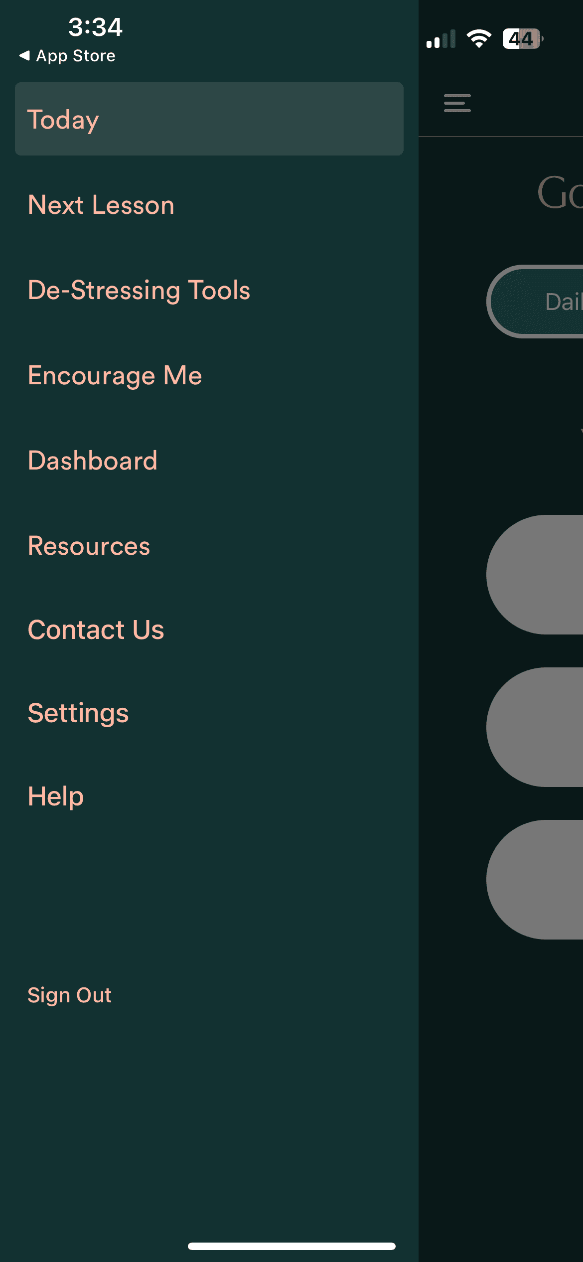
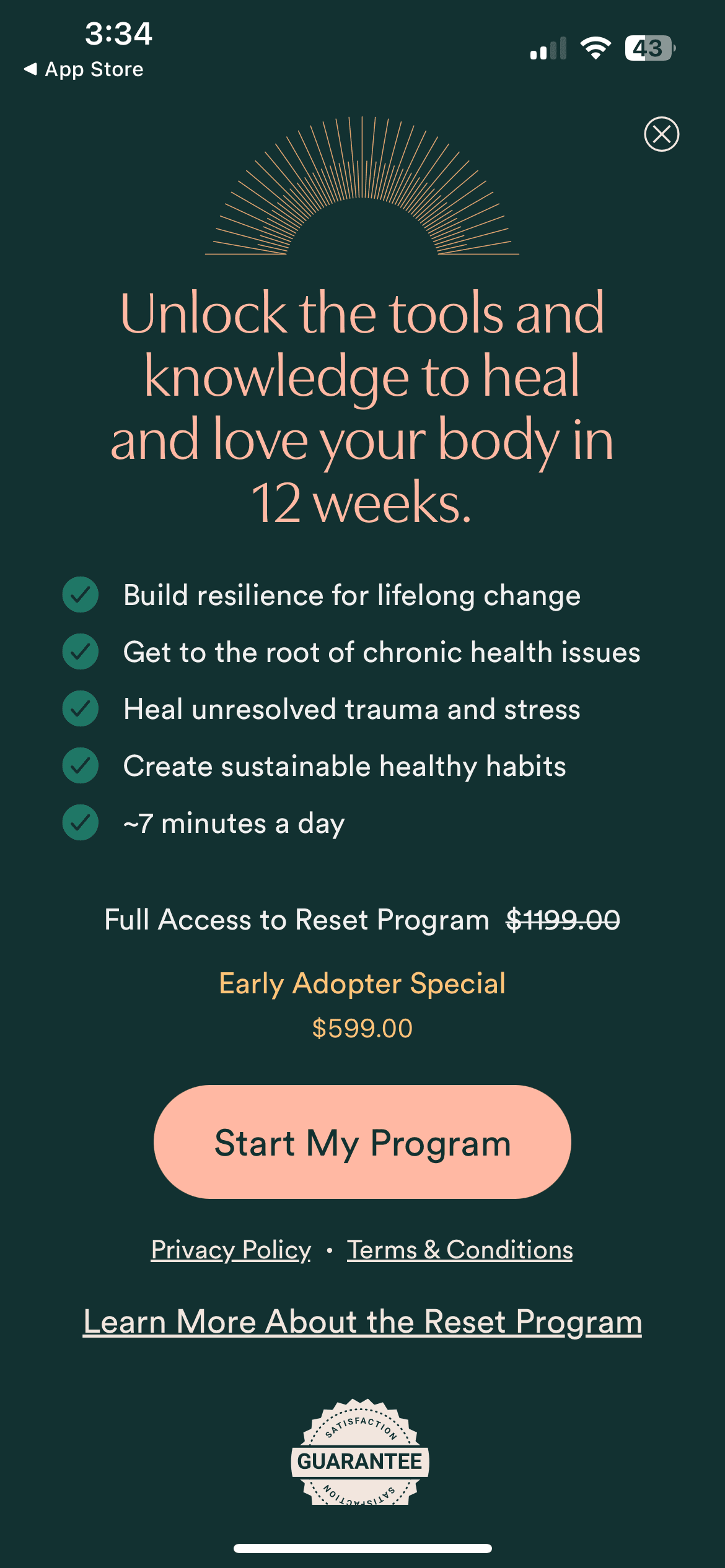
Paywall — Most of the app is free to access, but the way that paywall shows up makes discourages users from staying in the app longer. The only option displayed on there is the RESET program that is priced, after a discount, at $599.
Both "Next Lesson" and "Dashboard" took users to the paywall
The RESET program was the only option displayed on the paywall
Journal Prompt organization — The app currently has over 100 prompts that are only accessible via a horizontal scrolling carousel
Our first task, before everything else, was deciding how to connect past sprints with ours and other future design teams. We were given multiple design files, but none of them shared a design system. As a result, our team decided to put extra effort into creating a unified design system for the past, present, and future of this app.
Because research was done by previous teams, Shawna requested that we spend most of our time on designing and not create new personas. As a team, we were unwilling to forgo the research process entirely, so we agreed to instead use our research to corroborate previous research and build upon existing personas.
We also discovered that a paywall redesign may not be the most helpful solution for Shawna. She told us that she was planning to launch additional courses at differing price points in the future, and wanted the paywall to incorporate that as well. To contribute to the long-term growth of the app, we decided that it would be most useful for us to create a structure for Shawna’s paid content that she could use for the foreseeable future.
Shawna expressed to us that, because her target users are already overwhelmed by making themselves available for others, she wanted Your Daily to create a concierge-like, personalized experience. With that goal in mind, we began our research stage.
User research
For user interviews, we interviewed 3 current Your Daily users, and 4 non-users. We made sure that the non-users were women that are experienced with dealing with autoimmune diseases to stay true to Shawna's target market. Using the live app, we conducted contextual inquiries. For non-users, we wanted to see how comfortable they were with navigating the app for the first time and whether they felt catered to. With current users, we wanted to see how they incorporated the app into their daily lives, what motivated them to continue, and why they were a paying or free user. We also delved into what didn’t meet users’ expectations and how the app could be improved.
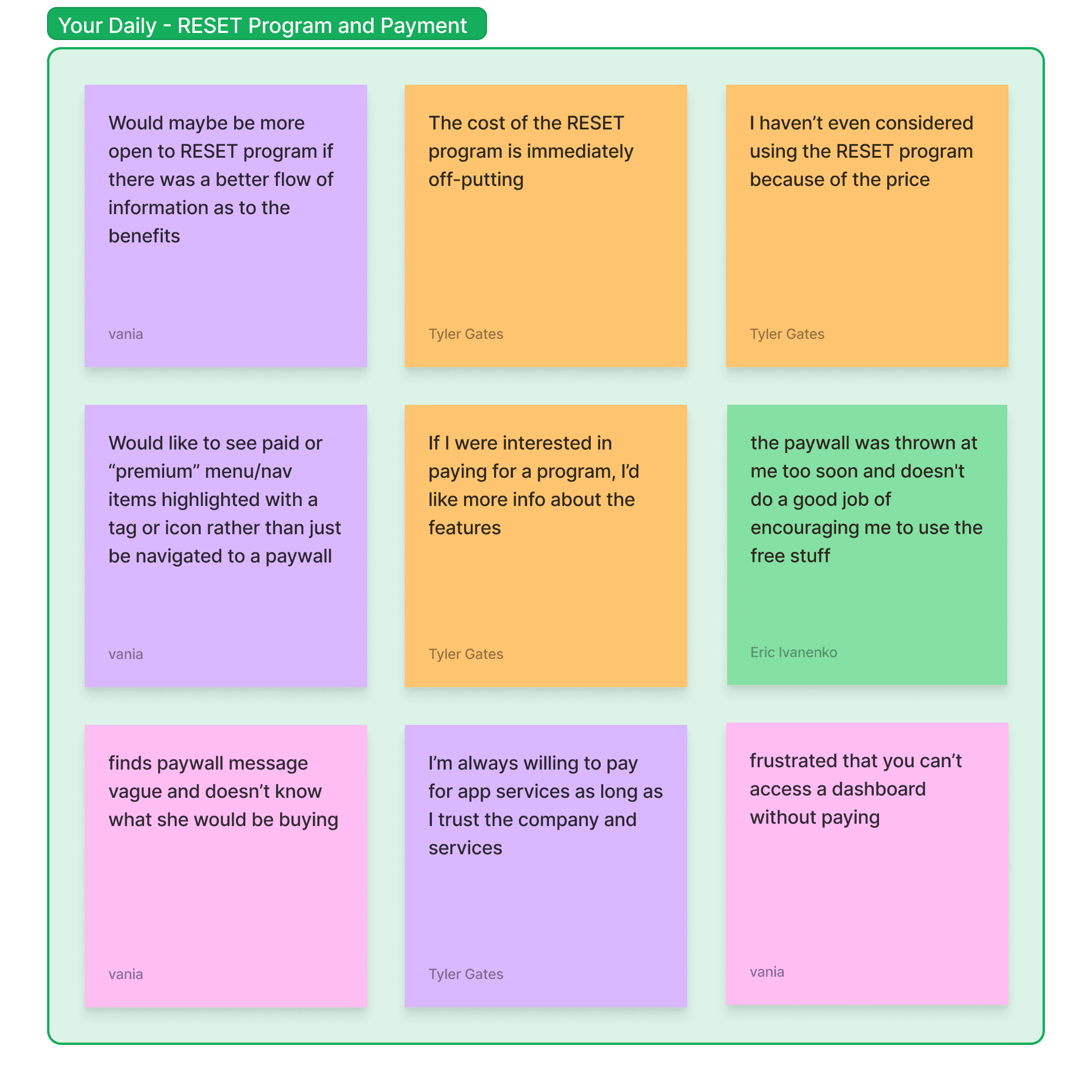
We synthesized our research via affinity mapping and the insights are as follows:
Users found value the self-care tools provided by the app, but felt that the content could be more personalized
The paywall is disruptive and does not provide enough product information
Meet our users
Using our synthesized data, we built upon two existing personas.
Gianna, 24
Gianna is hoping to find resources that can help her manage the mental and emotional aspects of living with vitiligo and improve her overall quality of life.
As a current user of Your Daily, she’s benefitted from the free content on the app and would like to try some of Your Daily’s paid programs.
As someone who’s more money-conscious, Gianna needs more transparency of information when it comes to courses and workshops to trust that they will improve her confidence and quality of life.
Jennifer, 43
Jennifer is looking to reinvigorate her self-care.
Though she's successfully achieved remission of her Hashimoto's, life has begun to overwhelm her and she no longer feels in control of her health and doesn’t know where to look for help.
Jennifer needs more personal and supportive tools to help her develop a more sustainable and authentic self-care routine.
Ideation
Upon completing research, we arrived at these main design goals:
Creating a structure for paid content that is easy to navigate and makes the user feel well-informed
Creating a welcome flow that guides users into the app seamlessly and makes users feel cared for
Creating an organization structure for journal prompts
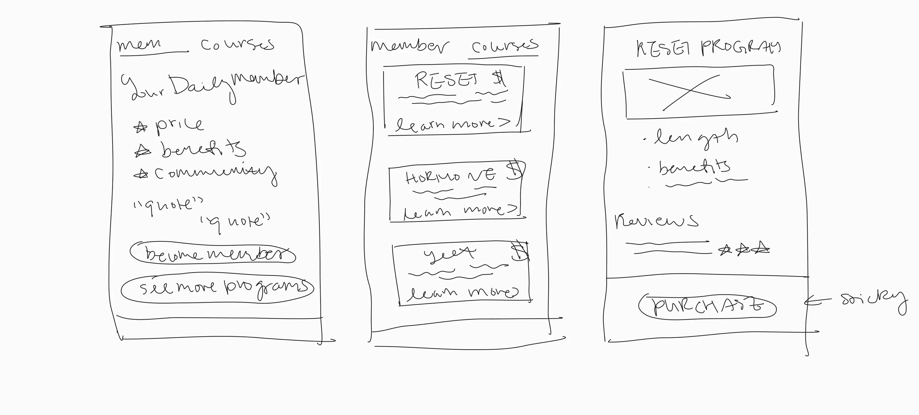
We began our design process by sketching. I focused on redesigning the paywall, the final screen of the welcome flow and homepage, and the journal prompt page.
Taking inspiration from our sketches, I created the initial lo-fi wireframes. Here are some of the key features:
A synopsis page that comes at the end of the welcome flow. It includes a synopsis and recommendations based on the user's response to the entry questionnaire. It also gives the option to see the Membership paywall or go directly to the homepage.
The paywall itself is split into two screens via a toggle, and the courses page leads into product pages with more information about specific courses.
The journal prompt page is now categorized by different topics and moods to better target user's needs.
After showing the wireframes to the founder and making requested adjustments, we prototyped the wireframes to prepare for usability testing.
Usability Testing
We then prototyped the frames and performed usability tests with users that we had interviewed earlier and current users of the app so they have an experience with the app they can compare our designs against.
User feedback indicated that the experience was improved and more personalized for them, and their concerns shifted to focus on specific content such as language that lacked clarity and better differentiation between paid and free content.
With this feedback, we then brought our wireframes into hi-fi.
How do we continue to grow Your Daily?
Because the goal of Your Daily is to involved in a user's health and self-care, it is important that the language being used be approved by a medical professional before going live in order for us to be responsible designers.
During usability testing, a user brought up that some autoimmune diseases may lead to flare-ups that limit a user's mobility. This would render the flare-up button inaccessible in it's button form alone. It would be extremely worthwhile to incorporate a more accessible design for this button.\
Though not all women have autoimmune diseases, many do experience stress or anxiety that may be assuaged by this app. I think more market research could be done to see what other users could also benefit from this app, and what other business opportunities are within reach.